Depth Techniques for Coloring Scenery and Landscapes
13 de outubro de 2026
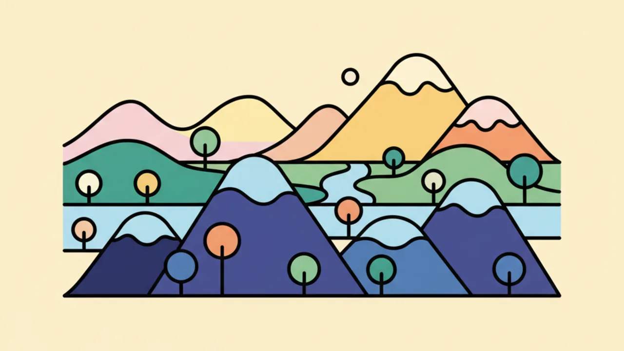
Master professional depth techniques to color landscapes and scenery on your favorite printable coloring pages with the Drawing & Coloring blog. 🎨✨
Landscape Coloring: Mastering Perspective and Depth
Understanding how depth works is the first step to turning your printable coloring pages into true three-dimensional masterpieces. When you open a blank page or a landscape line art for kids, the biggest challenge is creating the illusion that some elements are much further away than others.
Atmospheric perspective is the most important visual concept here. Basically, the farther away an object is, the less sharp and lighter it should appear. If you are coloring mountains in the background, use very soft blue or gray tones to give the feeling of air between the viewer and the mountain.
To apply this to your daily coloring activities, start by defining the horizon line. Everything below it and closest to the bottom edge of the paper is your foreground. These elements should have more saturated colors and more defined details, like the leaves of a tree or the texture of a rock.
Pro Tip: To create instant depth, color what is in front with warm colors (red, orange) and what is in the background with cool colors (blue, purple). This tricks the human brain into making the scenery recede.
The Role of Contrast in Depth
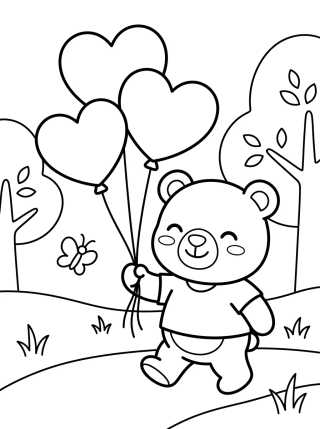
Contrast is your best friend when working with educational drawings. In a forest landscape, the trees that are "in your face" need deep black shadows or deep dark greens. Meanwhile, the trees forming the forest mass in the background should have reduced contrast, almost blending into the sky.
Using colored pencils of different grades or varying your hand pressure when filling in cute nature drawings helps create these layers. The gradient is the key technical tool to make the ground of the landscape seem to stretch on forever.
Layering and Visual Overlapping Techniques
Overlapping is the simplest and most effective way to suggest space in coloring pages. If a character is in front of a house, and the house is in front of a mountain, the brain automatically understands the order of depth. But how do you color this professionally?
You should color each layer thinking about visual weight. The front layers allow for techniques like hatching or stippling, which add physical texture. The back layers should be colored smoothly and evenly, without visible brush or pencil marks.
- Foreground: Sharp details, vibrant colors, and striking textures.
- Middle Ground: Neutral colors, simplified details, and moderate shading.
- Background: Pastel tones, absence of detail, and soft edges (blur effect).
- Sky and Horizon: The lightest part of the composition, often letting the white of the paper show through.
When you download your free coloring pages at Desenhando e Colorindo, try to identify these three layers before you start painting. Planning the light source helps maintain consistency across all these depths, ensuring shadows always fall on the same side.
Color Theory and Chromatic Perspective
Color theory is fundamental when talking about printable arts representing wide-open spaces. Chromatic perspective dictates that colors lose saturation as they recede. This means that bright grass green should only be used at the character's feet or at the start of the road.
As the road moves up the paper (heading toward the horizon), the green should gradually become aqua or a grayish-green. This simulates the effect of the Earth's atmosphere, which scatters light and removes the strength of colors over long distances.
Creating Vanishing Points with Colored Pencils
Even if the digital coloring book already comes with ready-made lines, you can reinforce the vanishing point. If there is a road or a river, color the edges that are further away thinner and lighter. The edges close to you should be wide and have stronger outlines.
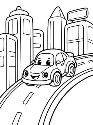
This creates a visual funnel that guides the viewer's eye directly to the center of the scene. It is a common technique in cityscapes or long streets, where buildings seem to shrink as they get further away.
Gradual Shading on Large Surfaces
Coloring large areas, like a field of flowers or a breezy sky, requires patience. To give depth to a sky, start with a dark blue at the top of the page and lighten it until it reaches an almost white tone near the land line.
This vertical gradient is what gives the sky its domed feel. Without it, the landscape looks flat, like a cardboard set. The same applies to the ground: color the base with more pressure and lighten your hand as the drawing moves up the sheet.
- Use circular motions to avoid harsh streaks in large areas of color.
- Light, overlapping layers are better than a single heavy layer.
- Leave white areas to simulate sun reflections (highlights).
- Mix gray tones into background colors to "mute" excessive saturation.
Master Tip: Use a kneaded eraser to lightly lift color from objects that should appear very far away or shrouded in mist, creating an ethereal depth effect.
Strategic Texturing for Realism
Texture communicates distance instinctively. In printable coloring sheets, you can create textures manually. Large rocks in the foreground can have cracks and dark spots. Distant mountains should be just soft silhouettes.
If you are coloring a seascape, nearby waves should have detailed crests and foam (leave the paper white here). On the horizon, the sea is just a straight, dark line. This differentiation in textures is what separates an amateur drawing from a technically deep piece of art.
The Influence of Sunlight on Scenery Colors
Light doesn't hit every part of the landscape the same way. The sun creates volume. When coloring trees, remember that the side facing the sun will be almost yellow, while the opposite side will be a very dark green or bluish. This volume helps push the tree "off" the paper, creating three-dimensionality.
Working with online coloring also allows for this control through gradient tools, but on paper, total control comes through pencil pressure. Remember that light also suffers from depth interference, becoming more diffuse on distant objects.
Materials That Help Create Depth
While any pencil works for coloring pages, some materials make creating depth easier. Watercolor pencils are excellent for backgrounds because they allow for soft, undefined washes. Permanent hard-lead colored pencils are great for the minute details of the foreground.
Using a "blender" pencil or even a cotton swab can help smooth out background colors, removing the paper's texture and giving the color a hazy look, which is perfect for simulating distance in natural settings.
Common Mistakes When Coloring Scenery
The most frequent mistake is using the same color intensity throughout the drawing. If you use the same navy blue in the distant sky and on a bird in the foreground, the bird will "disappear" into the landscape. Another mistake is outlining everything with a thick black pen; this kills atmospheric depth instantly.
Try to keep background outlines as discreet as possible. If the line art for kids is very bold, try covering the black lines in the background with lighter colors so they don't pop as much as the main figures.
Frequently Asked Questions
How do I make the background look far away in a coloring page?
Use lighter, bluish, or grayish tones and avoid details. The lack of contrast and sharpness makes the human eye interpret that area as being distant.
What is the best color for shadows in landscapes?
Avoid using just black. For shadows in vegetation, use dark blue or purple. This keeps the color vibrant and natural, creating a richer, less "muddy" depth.
Can I use markers to create depth?
Yes, but it's harder to make gradients. The tip is to use pastel-toned markers for the background and vibrant colors only for the main elements in the foreground.
What is atmospheric perspective?
It is the visual effect where the Earth's atmosphere changes the appearance of distant objects, making them lighter, less detailed, and generally cooler (bluer) than nearby objects.
Conclusion
Mastering depth techniques transforms the simple act of coloring into an exercise in perception and creativity. By applying the correct contrast, choosing the right colors for the horizon, and respecting the layers of the scene, your printable coloring pages will come to life with realism. Now that you know these secrets, why not put them into practice? Explore our vast library at Desenhando e Colorindo, pick your favorite landscape, grab your pencils, and start creating windows into new worlds right now!
Escrito e revisado por Armando Amaro
Fundador do Desenhando e Colorindo. Todo artigo passa por curadoria e revisão humana antes de ser publicado.