Best Color Palettes for Nature Coloring Pages
21 de agosto de 2026
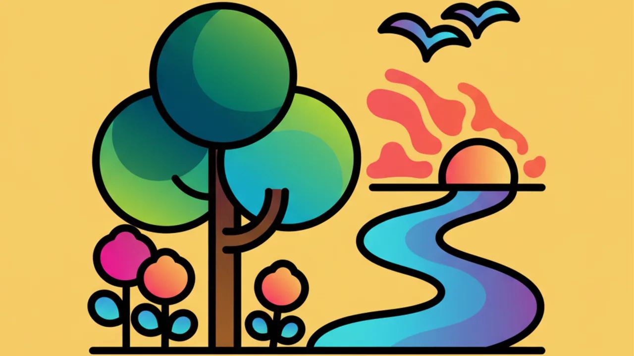
Bring your art to life with these stunning color combinations for nature scenes! Check out our expert tips for coloring and printing at Desenhando e Colorindo. 🌿✨
The Psychology of Colors Applied to Nature Drawings
Choosing the right colors for your coloring pages is the first step to transforming a blank sheet into a true work of art. When it comes to nature, the palette is endless, but understanding how colors interact helps create depth and realism, even in cute drawings.
When selecting a forest-themed kids' line art, for instance, using different shades of green is essential. Light green can indicate new, sun-kissed leaves, while moss green or emerald green brings a sense of shade and density. At Desenhando e Colorindo, we encourage exploring these variations to stimulate children's visual perception.
Beyond realism, colors evoke emotions. Blue and lilac tones in river or flower drawings bring calmness, while vibrant oranges and reds in sunsets or tropical flowers awaken energy. The secret lies in balancing these sensations according to the theme of your printable coloring page.
Harmonious Combinations for Forests and Jungles
Forests are among the most popular themes to print for free. To ensure the final result is visually pleasing, we recommend the analogous color technique. This means using colors that are close to each other on the color wheel, such as yellow, lime green, and forest green.
To add a touch of professionalism, try the shading technique. Start with the lightest color over the entire area and gradually add darker tones to the edges or where light wouldn't directly hit. This is an excellent way to practice intermediate-level coloring activities.
Pro Tip: When coloring tree trunks, don't just use brown. Mix in a bit of gray for an aged bark look or a hint of purple in deep shadow areas to create dynamic and modern contrast.
Highlighting Elements in Vegetation
In a digital coloring book or printed one, details make all the difference. Small red berries hidden among green foliage create a complementary contrast that immediately draws the eye. This contrast between opposite colors (like red and green) is one of the golden rules of design applied to children's art.
Colors for Aquatic Landscapes: Oceans and Rivers
Many people limit online coloring of water to just light blue. However, nature shows us that water reflects everything around it. In lake drawings, try to include green reflections from trees or yellowish tones if there's strong sunlight in the picture.
For deep oceans, transitioning from baby blue to navy blue creates a fantastic illusion of depth. Adding touches of turquoise and sea green in shallow areas helps create that paradisiacal beach look everyone loves to find in printable artwork.
- Turquoise Blue: Ideal for shallow, tropical waters.
- Indigo Blue: Perfect for the deep sea or starry nights reflected in the water.
- White or Light Gray: Use for wave foam or the sun's glare on the surface.
- Soft Purple: Great for shading corals and underwater reefs.
The Challenge of Flowers and Exotic Plants
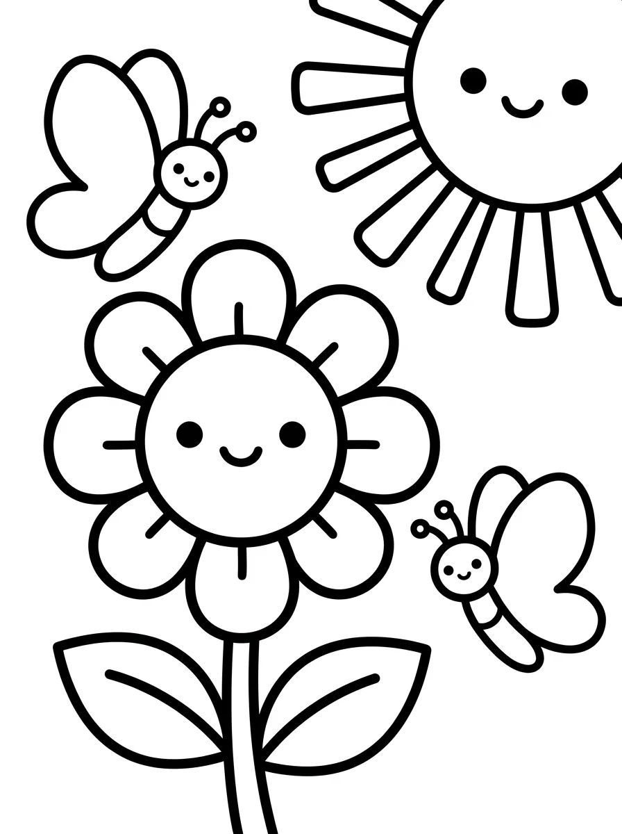
Flowers offer the most creative freedom at Desenhando e Colorindo. Here, color rules can be broken for the sake of imagination. Neon shades, soft gradients from pink to white, and mixtures of purple with yellow are highly recommended for educational drawings about botany.
An interesting trick for coloring petals is to use the pencil or brush stroke from the center of the flower outwards. This creates natural lines that mimic the veins of real plants. If you're using AI-generated drawings, you'll notice that texture details are perfect for testing these filling techniques.
Skies and Atmospheric Phenomena
The sky isn't just blue. Depending on the time of day depicted in your coloring picture, combinations change dramatically. During this month of August, the sky often features very clear blue tones, ideal for practicing horizontal gradients.
For a classic sunset, the recommended sequence is: yellow near the horizon, followed by orange, vibrant pink, and finally, a purple or dark blue at the top of the page. This transition, when done smoothly, transforms a simple coloring sheet into a cinematic scene.
How to Choose the Ideal Materials
The choice of material directly influences color mixing. For nature themes, having a good variety of tools makes a difference. At Desenhando e Colorindo, our artworks are optimized for different types of paper and pigments.
- Watercolor Pencils: Excellent for creating mist effects and transparency in water.
- Crayons: Great for quickly filling large areas of grass or sky.
- Markers: Perfect for outlining kids' line art and details of insects or flowers.
- Gouache Paints: Ideal for children learning to mix primary colors to form earthy tones.
The Importance of Neutral Colors in Nature
While vibrant colors grab attention, neutral tones like beige, gray, light brown, and off-white are the foundation of any realistic natural landscape. Rocks, dirt paths, and dry tree trunks require this more subdued palette so that colorful elements, like birds or flowers, truly shine in your coloring book.
Using gray to create rain clouds or shadows on the ground helps give weight and volume to objects. Without the contrast of neutrals, the drawing can appear overly saturated and tiring to the eyes. Balance is the keyword when the goal is to create a relaxing coloring activity.
Integrating Technology and Tradition: AI Drawings
One of the novelties on the Desenhando e Colorindo website is the possibility of using AI-generated drawings. These images have intricate details that challenge even the most experienced colorists. AI can generate foliage patterns and animal skin textures that are perfect for testing complex palettes.
When downloading one of these artworks, try to observe the light patterns suggested by the lines. Often, the drawing itself indicates where the colors should be more intense. This makes learning about light and shadow much more intuitive for students and teachers in the classroom.
Frequently Asked Questions
What is the best color to start painting a landscape?
We recommend always starting with the lightest colors and the largest areas, such as the sky or the background of the image. This prevents you from smudging the drawing by resting your hand on darker tones that have already been applied.
How to create a realistic grass effect?
Instead of painting a solid green block, make small vertical strokes using three different shades of green. This creates the illusion of individual blades of grass and adds texture to your coloring and printable drawing.
Can I use colors that don't exist in nature?
Absolutely! Desenhando e Colorindo encourages creativity. Creating a tree with blue leaves or a pink river is a great way to explore the world of fantasy and abstract art.
How to prevent the paper from tearing when using too much color?
When you print our drawings for free, prefer papers with a higher grammage (like 120gsm or 180gsm) if you intend to use many layers of pencils or wet materials like watercolors and markers.
Now that you've mastered the best color combinations to bring fauna and flora to life, how about putting this knowledge into practice? Browse our categories, choose your favorite coloring pages, and start creating a world full of color and life right now. At Desenhando e Colorindo, the fun never ends, and your creativity is the only limit. Access our gallery of printable artworks and have fun!
Escrito e revisado por Armando Amaro
Fundador do Desenhando e Colorindo. Todo artigo passa por curadoria e revisão humana antes de ser publicado.