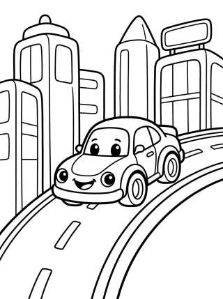
Cityscape Coloring Pages: Tips for Realistic Buildings
20 de outubro de 2026

Master the art of realistic cityscapes with our depth and lighting tips. Download free printable city coloring pages and start creating today!
Exploring the world of cityscape coloring pages is one of the most rewarding ways to develop your artistic skills, especially when focusing on architecture. Creating buildings that seem to pop off the page requires attention to detail that goes beyond simple outlines. When picking your printable coloring pages, the first step toward realism is understanding how light interacts with the vertical surfaces of the city.
The Importance of Perspective in Building Drawings
For a building to look realistic on your coloring page, perspective is the fundamental foundation. Even in pre-made illustrations, identifying vanishing points helps you decide where to apply denser shadows. Buildings aren't just rectangles; they have depth that can be highlighted with the right color choices.
Whether you're working on kids' line art or more complex designs for adults, observe how lines converge toward the horizon. This creates the illusion that the structure occupies a real three-dimensional space. When coloring, try to keep your strokes following the direction of these lines to reinforce the building's structure.
Using the Vanishing Point to Your Advantage
If you're using our educational drawings to teach geometry, show how the sides of a skyscraper shrink as they recede. In city-themed coloring activities, this translates to using lighter tones on faces facing the light and progressively darker tones on the side faces that lead toward the vanishing point.
Shading Techniques for Windows and Facades
The secret to a realistic building lies in the windows. Avoid painting them all one solid color. In a real urban landscape, windows reflect the sky, other buildings, or show a lit interior. In your free printable coloring pages, try creating gradients within each small square of glass.
Use a pale blue at the top of the window and darken it to black or gray at the base to simulate the reflection of the street or cast shadows. This variation brings the facade to life and prevents the drawing from looking flat or artificial.
Pro Tip: Use a white colored pencil or a white gel pen to add tiny glints of light in the corners of the windows after you've finished painting. This creates a flawless glass effect on your coloring sheets.
Textures of Urban Materials
Differentiating concrete from metal and brick is essential. For concrete, use light circular motions with a gray pencil, letting the paper's texture show through. For metallic surfaces, like support beams, use sharp contrasts between very light and very dark areas, creating that polished look typical of modern cities.
How to Create Depth with Color Layering
When you download your printable art from Desenhando e Colorindo, you'll notice some landscapes have multiple buildings on different planes. For realism, use the atmospheric perspective technique: buildings that are further away should be colored with lighter, slightly bluish or grayish tones.
Foreground buildings should feature vibrant colors and sharp contrasts. This technique is highly effective in both digital coloring books and on paper, as it guides the viewer's eye through the urban scene, creating a sense of vastness and scale.
- Foreground: Saturated colors, sharp details, and intense black shadows.
- Midground: Neutral colors, simplified details, and medium gray shadows.
- Background: Washed-out colors, almost no detail, and soft outlines.
Solar Lighting and Cast Shadows in the City
Decide where the sun is coming from before starting your coloring pages. If the sun is on the right, all buildings should have their left side shaded. This creates visual consistency and makes the scene look like a photograph instead of a jumble of loose shapes.
Cast shadows on the ground, between one building and another, are also crucial. They help "anchor" the architecture to the terrain. Use dark purple or navy blue tones instead of just black for shadows, as this adds a more artistic and realistic touch to your printable drawing.
Sky Colors and Urban Reflections
The sky sets the mood for your cityscape. A sunset sky with orange and pink tones should reflect in the windows of glass buildings. A cloudy sky, on the other hand, calls for more sober colors and less defined shadows. Integrating the sky color into the building reflections is what separates a beginner from an advanced colorist.
Ideal Tools for Coloring Architectural Landscapes
To get the best results on our cute city drawings or detailed line art, the choice of material matters. Watercolor pencils are excellent for creating smooth gradients in the sky, while fineliners help reinforce structural details like columns and balconies.
If you prefer coloring online, use gradient tools to simulate the curvature of cylindrical buildings or the slant of roofs. The versatility of our files allows you to experiment with both physical and digital media in high quality.
- Colored Pencils: Ideal for brick and concrete textures.
- Alcohol Markers: Perfect for quickly filling large facades.
- Pastels: Great for blending the sky and creating realistic atmospheric haze.
- Ink Pens: To reinforce windows and cast-iron details.
Adding Signs of Life to Structures
A realistic building isn't just concrete and glass; it has signs of life. When painting your coloring pages, add small details like plants on balconies, air conditioners in windows, or even a bit of "grime" on roof edges using brown or moss green tones.
These micro-details help tell a story. A building with vines on the walls looks old and historic, while a building with neon colors and clean lines suggests a futuristic metropolis. Use your creativity to personalize your coloring activities according to your artistic vision.
Tip for parents and teachers: When using educational drawings of cities, encourage children to identify different types of housing and businesses while they color, stimulating spatial and social perception.
Frequently Asked Questions
What is the best color to shade white buildings?
For white or very light-colored buildings, use tones of grayish-blue or light lavender for the shadows. Pure black can make the drawing look dirty, while bluish-gray maintains the feeling of reflected natural light.
How do I prevent paper from wrinkling when coloring large city areas?
When printing your free printable coloring pages, opt for paper with a weight above 120g (cardstock) if you're using markers or watercolors. If using standard printer paper, apply light layers of colored pencil without pressing too hard.
Can I mix colored pencils and markers on urban drawings?
Yes! A common technique is to use markers for base colors and colored pencils on top to create shadows and textures. This gives a professional and vibrant finish to your coloring pages.
How do I create the effect of lights on in windows at night?
Paint the inside of the window with a vibrant yellow or orange and, around the frame, lightly shade with the same pencil to simulate light glowing onto the outer wall. Keep the rest of the building in dark shades of blue or purple.
Exploring the world of architecture through art is a fascinating journey that exercises patience and observation. At Desenhando e Colorindo, we offer a vast library of printable coloring pages so you can apply all these techniques today. Pick your favorite scene, grab your supplies, and start transforming simple lines into vibrant, realistic metropolises. Fun is just a click away!
Escrito e revisado por Armando Amaro
Fundador do Desenhando e Colorindo. Todo artigo passa por curadoria e revisão humana antes de ser publicado.