Mastering Color Harmony in Line Art: A Practical Guide
28 de setembro de 2026
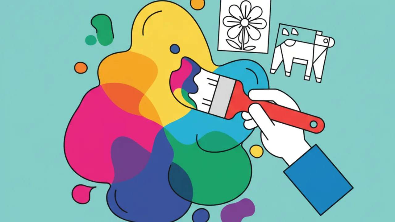
Learn color theory to bring your coloring pages to life at Desenhando e Colorindo. Pro tips on color harmony for stunning line art and illustrations. 🎨✨
Understanding the Color Wheel in Free Coloring Pages
For those looking to level up their kids' line art or adult coloring projects, the color wheel is the ultimate tool. It organizes colors so we can visualize which tones go best together when filling in our free drawings.
When you open one of our printable coloring pages, think of the primary colors (blue, red, and yellow) as the foundation. From there, mixing creates secondary and tertiary colors that bring depth and realism to your art.
Using color theory isn't just for professional artists. Parents and teachers can use these techniques to teach educational drawings, helping kids understand how the visual world is built through light and pigment.
Pro tip: Before you start painting your favorite drawing, test your colored pencil combinations on a separate scrap of paper to check if the transitions between tones are smooth.
Monochromatic Harmonies: The Power of a Single Hue
One of the simplest and most elegant ways to color your coloring sheets is to use monochromatic harmony. This consists of picking a single color and working with different shades, tints, and saturations of it.
Imagine downloading an ocean scene from Desenhando e Colorindo. Instead of using random colors, you only use shades of blue: from dark navy for the deep sea to baby blue for the seafoam. This creates an immediate sense of calm and visual cohesion.
This technique is excellent for those just starting to explore digital coloring books or physical ones, as it reduces the anxiety of picking "the right color" and lets you focus on pencil control or digital brush strokes.
Benefits of Monochromatic Painting
- Makes learning light and shadow in cute drawings easier.
- Creates visually balanced and professional-looking art.
- Helps highlight subtle details in the line art.
- Reduces material waste in coloring activities for kids.
Complementary Colors: Contrast and Vibe in Your Art Prints
If you want your printable coloring drawing to really pop, complementary harmony is the way to go. Complementary colors are those located on opposite sides of the color wheel, like purple and yellow, or green and red.
When placed side by side, these colors boost each other's intensity. In a superhero drawing or tropical flowers, using this contrast makes the image look like it's jumping off the page, grabbing everyone's attention.
For classroom coloring activities, explaining the concept of complementary colors helps students understand the visual impact of colors in advertising and nature, making learning much more dynamic and visual.
Analogous Harmony for Nature and Landscape Drawings
Analogous colors are neighbors on the color wheel, such as green, yellow-green, and yellow. They are frequently found in nature and convey a sense of serenity and natural harmony.
When selecting coloring pages that depict forests, gardens, or sunsets, choosing analogous colors ensures that the transition between elements is smooth. It’s the perfect technique for those who love manual gradients with colored pencils or crayons.
This approach is highly recommended for AI-generated drawings that have many organic details, as neighboring colors prevent the drawing from looking visually cluttered or confusing for a child.
How to Successfully Apply Analogous Colors:
- Choose one dominant color for the largest part of the drawing.
- Use neighboring colors for details and light shading.
- Add a touch of white or black to create depth variation.
- Keep the color temperature (warm or cool) consistent.
- Choose colors that naturally blend together.
Color Psychology in Coloring Activities
Color theory goes beyond aesthetics; it involves emotions. When choosing free printable coloring pages, the choice of colors can influence the mood of the person painting. Warm colors like orange and red bring energy, while cool tones like blue and violet promote relaxation.
Even though the seasons vary by region, pastels and vibrant flower colors are always great choices to refresh a child's coloring book. Colors help express feelings that little ones often can't put into words.
Teachers can use educational drawings to work on these emotions, asking students to paint how they feel that day, using color theory as a non-verbal communication guide.
Printing Tip: If you're going to use alcohol-based markers for your harmony techniques, use a higher paper weight (above 120g/32lb) when printing our files to prevent ink from bleeding through the back.
The Importance of White Space and Breathing Room in Line Art
A common mistake when using coloring pages is trying to fill every single millimeter with intense color. In color theory, white space (or areas with very light colors) acts as "breathing room" for the eyes, allowing the saturated colors to truly shine.
When working with kids' line art, leave some areas unpainted or use very soft shades of gray or beige to simulate reflected light. This gives the object three-dimensionality and makes the chosen harmony more appreciated.
At Desenhando e Colorindo, our lines are designed to offer this balance, allowing both beginners and advanced colorists to achieve incredible results in their coloring drawings.
Shading Techniques to Bring Free Drawings to Life
Shading is what transforms a flat painting into a realistic piece of art. Using color theory, instead of shading only with black (which can make the drawing look muddy), try using darker analogous colors or desaturated complementaries.
For example, to shade a red object, try a very light touch of dark green or deep blue. This creates a much richer and more vibrant shadow than simple gray. It's an advanced technique that older kids and adults love applying to their printable coloring pages.
With constant practice on our printable art, visual perception improves drastically, turning the coloring hobby into a journey of constant technical and creative evolution.
Frequently Asked Questions
How do I choose the best color palette for a drawing?
Start by defining the mood of the art. If you want something calm, use cool analogous tones. If you want something energetic, use warm complementaries. Looking at references in nature helps a lot when deciding the palette for your coloring pages.
Can I mix colored pencils and markers on printable drawings?
Yes! Using mixed media is excellent. You can use markers for the base colors and colored pencils on top to create gradients and detailed shadows in the line art, resulting in a professional finish.
What is the color wheel and where can I find it?
The color wheel is a visual representation of colors visible to the human eye. You can find simplified versions online or at art stores to help you choose colors for your coloring sheets.
How do I teach color theory to young children?
Use simple examples, like mixing primary paints to see new colors emerge. Use our educational drawings to practice filling shapes with colors they see in everyday life, like the blue sky and green grass.
Now that you've mastered the secrets of color harmony, it's time to put all this knowledge into practice! Browse our categories, pick your favorite free printable coloring pages, and start creating spectacular art today at Desenhando e Colorindo. The fun is just a click away!
Escrito e revisado por Armando Amaro
Fundador do Desenhando e Colorindo. Todo artigo passa por curadoria e revisão humana antes de ser publicado.