Pro Tips to Make Your Coloring Pages Bold and Vibrant
16 de setembro de 2026
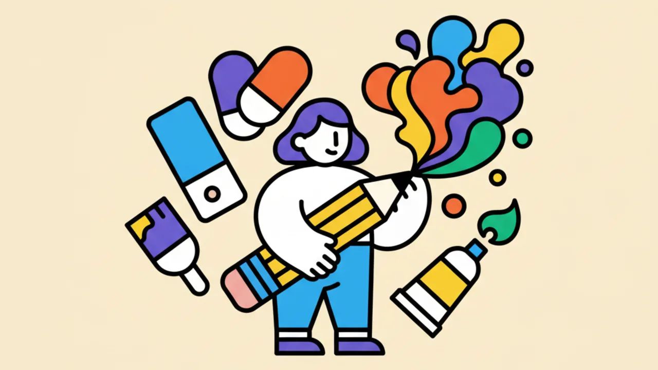
Learn how to make your coloring pages stand out with simple techniques for pressure, layering, and picking the right tools at Desenhando e Colorindo.
Pressure Techniques for Vibrant Coloring
To ensure your free printable coloring pages have intense colors, the first step is understanding the pressure applied to the paper. Many beginners think you just need to press the pencil hard, but this can damage the paper fibers and create an unwanted waxy sheen.
The correct way to intensify the tone is to work with the pencil's tilt. By coloring with the pencil slightly angled, you cover a larger area evenly. As you want darker shadows and saturated colors, you should gradually increase the pressure, maintaining control so you don't leave marks on the back of the sheet.
Pro Tip: Always start with light pressure to map out the colors and only ramp up the tone in deep shadow areas to create contrast.
Remember that the paper matters too. On coloring pages printed on standard printer paper, saturation takes longer to appear. On higher-weight paper, the pigment adheres better, allowing the coloring to look visibly bolder and more professional.
The Secret of Layering
Bold coloring isn't born from a single pencil stroke. The secret of great children's line art artists is layering. By applying several thin layers of the same color, you fill in the tiny white spots of the paper (the tooth), resulting in a solid, flat color.
Interleaving analogous colors also helps add depth. If you're coloring a nature scene, try putting yellow down before the green. This will make the green look much more vibrant and luminous, making the final art stand out impressively.
Choosing Materials: Colored Pencils and Markers
Not all materials are equal when aiming for intense color. To achieve educational drawings with a high-quality finish, the choice between school-grade and artist-grade pencils makes a difference. Pencils with a higher pigment concentration and softer cores (waxy) deliver bold colors with much less effort.
If you love extremely saturated colors, alcohol or water-based markers are excellent allies. They fill the paper instantly with liquid pigment. At Desenhando e Colorindo, we recommend using markers only on thicker sheets to prevent the ink from bleeding through your printed digital coloring book.
- Watercolor pencils: Allow you to dilute the pigment to cover large areas and then reinforce with dry pencil on top.
- Felt-tip pens: Great for outlines and small details that need maximum pop.
- Soft pastels: Ideal for smooth backgrounds, which can be intensified with fixative layers.
- Premium crayons: Offer a rich texture that fills the paper quickly.
Preparing the Paper for Color
Before you start coloring your cute drawings, check the surface you're working on. Rough surfaces, like wood tables with visible grain, can transfer unwanted textures to your art, preventing the color from staying uniform and strong.
Always use a clipboard or a stack of smooth sheets under the drawing you are coloring. This creates a soft base that allows the pencil tip to penetrate better into the paper fibers, resulting in a much denser and homogeneous color coverage.
The Burnishing Technique
Burnishing is an advanced but simple technique to apply to home coloring activities. It consists of using a white pencil or a blender over the already applied colors, exerting strong pressure to blend the pigments and eliminate any trace of white paper.
When you burnish, the surface of the painting takes on a polished, shiny look, almost like an oil painting or a sticker. This gives your free printable coloring pages a professional-level look, ideal for those who want to frame their art once finished.
Blending Colors for Maximum Saturation
Often, a pure pencil color looks dull. To make it bolder, try mixing tones. A dark blue can become much deeper if you apply a light layer of purple underneath. This optical blending tricks the eye and makes the color perception much more intense than using just one isolated color.
At Desenhando e Colorindo, we encourage experimentation. Test mixing warm and cool colors in small areas to see how the saturation reacts. Complementary contrast (like placing orange near blue) also makes the colors seem to jump off the page, appearing stronger because of the visual opposition.
How to Avoid Smudging and Maintain Intensity
A common problem when trying to color boldly is smudging. When we apply too much pressure, excess pigment can lift off the paper and get on your hand, which in turn smudges the white areas of the drawing. This takes away the impact of the bold color by reducing the contrast with the clean background.
To avoid this, place a clean sheet of paper under your hand while you color. This protects the line art and ensures the colors stay exactly where you put them. Keeping your pencil tip sharp also helps concentrate pigment in smaller areas, increasing color strength in the details.
- Use a high-quality sharpener so you don't break the internal lead.
- Clean off eraser crumbs with a soft brush, never your hand.
- Work from top to bottom and left to right (if right-handed) to avoid smudges.
- Fix the finished drawing with varnish spray to keep the color vibrant for years.
Lighting and Workspace
The perception of a strong painting also depends on light. Coloring under yellow light can make you believe the color is saturated when it’s actually light. Always prefer natural light or cool white LED bulbs to see the true colors of your coloring sheets.
When lighting is adequate, you can identify where the pencil coverage is patchy and where it needs more layers. This ensures that the final result is art with solid, vibrant colors, worthy of a kid's art gallery or an adult hobby portfolio.
Using Shadows to Highlight Bold Colors
A color only looks truly bold when placed next to contrast. To make the red in your drawing look incredibly alive, use well-defined shadows with dark brown or navy blue in folds and corners. The contrast between the brightness of the pure color and the darkness of the shadow gives the painting volume and visual punch.
Avoid using pure black for shadows right away, as it can "muddy" the color and make it look lifeless. Prefer chromatic dark colors to maintain the vibration of your printable art. Save black only for final details and outlines that need extra-strong definition.
Finishing Touches with Gel Pens and Details
After applying all the strength with colored pencils, you can use white gel pens to add highlights. These bright spots create extreme contrast that makes the surrounding colors look even more saturated and deep. It’s the perfect final touch for characters and nature elements.
At Desenhando e Colorindo, we have various themes that benefit from these techniques, from detailed animals to complex landscapes. Applying these tips transforms a simple pastime into a true artistic practice, developing motor coordination and aesthetic sense in a fun way.
Frequently Asked Questions
How to make colored pencils look bolder without breaking the tip?
The best way is to apply several light layers in different directions (horizontal, vertical, and circular). This fills the paper fibers without requiring pressure that forces the pencil lead to its limit, preventing frequent breaks and wasted material.
What is the best paper for achieving vibrant colors?
Papers with a weight above 120g/m² (approx. 32lb) are ideal, as they handle more pigment layers and techniques like burnishing. Very smooth papers can make adhesion difficult, while slightly textured ones hold the pencil better, resulting in more intense colors.
Can I use markers over colored pencils?
Generally not recommended, as the pencil wax creates a waterproof layer that can ruin your marker's tip. The ideal way is to use markers first for base areas and then apply colored pencils for shading and finishing.
How to color large areas evenly and strongly?
Keep the pencil at a medium point (not too sharp, not too blunt) and use small, constant circular motions. This avoids streak marks and ensures the color is distributed equally across the entire surface of the drawing.
Now that you’ve mastered the techniques to create incredible, vibrant art, how about putting it all into practice? Explore our vast collection at Desenhando e Colorindo, pick your favorite themes, and enjoy our free printable coloring pages to create works of art full of life and color. Grab your pencils, get your supplies ready, and start the fun right now!
Escrito e revisado por Armando Amaro
Fundador do Desenhando e Colorindo. Todo artigo passa por curadoria e revisão humana antes de ser publicado.