Landscape Coloring: How to Use Color Theory for Beautiful Art
21 de agosto de 2026

Learn how to apply color theory to your landscape coloring pages. Level up your art with simple mixing and matching techniques at Desenhando e Colorindo.
Understanding the Color Wheel in Landscape Drawings
To start bringing your landscape coloring pages to life, the first step is understanding the color wheel. This tool helps you visualize how colors relate to one another, allowing you to choose shades that harmonize with the sky, greenery, and mountains naturally.
When selecting a nature coloring page, you can opt for analogous colors (those sitting side-by-side on the wheel) to create a sense of calm. For example, using different shades of green and blue in a forest setting brings a relaxing visual flow for anyone coloring.
Color theory isn't just for pros; kids and beginners can use this knowledge to make coloring activities much more interesting and visually striking, exploring contrast and depth in every element of the scenery.
The Importance of Complementary Colors in Line Art
Complementary colors are those located on opposite sides of the color wheel. When applied to kids' landscape line art, they create a vibrant contrast that makes the drawing "pop" off the page. A classic example is using orange for the sun and purple for the shadows of the clouds.
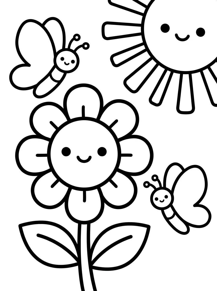
At Desenhando e Colorindo, we encourage using these combinations to highlight specific elements. If you’re coloring a field of flowers, using red on the petals against an intense green background will make each flower stand out individually, transforming a simple drawing into a masterpiece.
Experimenting with these combos in cute drawings of gardens or parks helps develop visual perception. The secret is to be bold but balanced, managing color intensity so the final result is easy on the eyes.
Pro-tip: When using complementary colors, try choosing one color as the dominant one and the other just for details. This prevents the drawing from becoming visually overwhelming and keeps the landscape harmonious.
Creating Depth with Warm and Cool Tones
Depth is essential in landscape drawings. The basic rule of color theory for depth is: warm colors (red, yellow, orange) appear to be closer, while cool colors (blue, purple, teal) appear to be further away.
When you print our educational drawings of mountains, try painting the mountains in the background with light blue or blue-grey tones. This creates an atmospheric perspective effect, simulating how we see nature in real life, where the air between us and a distant object shifts the original color.
On the other hand, elements in the foreground—like nearby trees, rocks, or grass—should be colored with warmer, more saturated tones. This technique turns a digital coloring book or printout into a practical visual arts lesson, stimulating children's spatial awareness.
Foreground Elements
- Intense greens and yellowish-greens for nearby lawns.
- Reddish-browns for detailed tree trunks.
- Vibrant colors on flowers and shrubs at the base of the drawing.
- Use of dark tones to define shadows cast on the ground.
Background and Horizon Elements
- Pale blues for distant mountain peaks.
- Pastel colors for the sky near the horizon line.
- Greyish-greens for forests far off in the scenery.
- Soft violet to represent mist or dawn in the distance.
Color Psychology in Natural Landscapes
The choice of colors also affects the emotions a drawing conveys. When picking free coloring pages to print with nature themes, think about the mood you want to create. Yellow and orange tones evoke joy and energy, perfect for a sunny day at the park.
On the other hand, a night landscape or a forest in the rain calls for shades of blue, indigo, and grey, which transmit tranquility or mystery. While practicing online coloring or using paper, children learn to associate moods with different color palettes, which is vital for creative development.
Using color theory allows every printable art piece to tell a different story. The same forest drawing can be a magical morning or a melancholy dusk, depending entirely on how the artist distributes the colors.
Analogous Harmony for Soft Landscapes
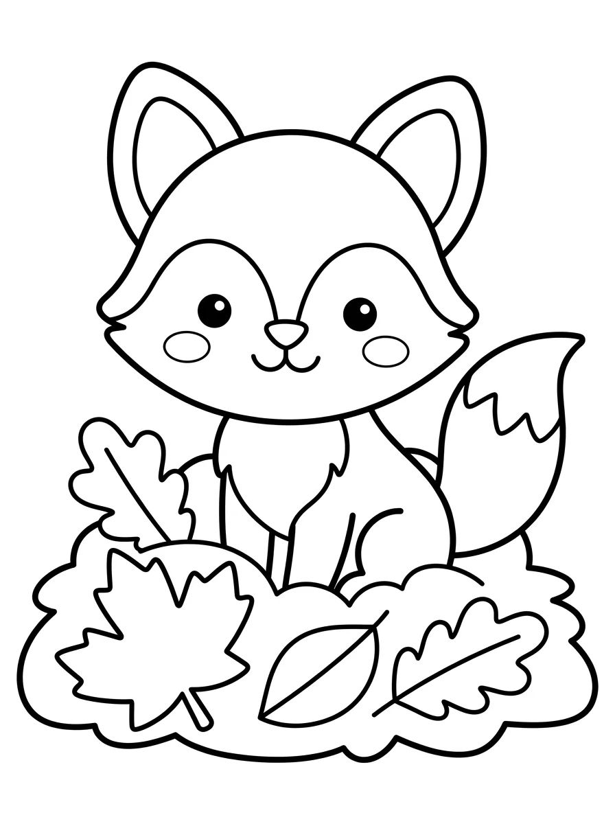
Analogous harmony consists of using colors that are near each other. In autumn coloring pages, for example, you would use variations of yellow, orange, and red. This technique creates a smooth, very natural transition, perfect for representing seasonal changes.
Applying these variations to the AI-generated drawings on our platform ensures unique and sophisticated results. Painting with analogous colors is a great way to train the eye for subtleties in tone and saturation.
Instead of using just one green colored pencil, try mixing three different shades of green to add texture to the leaves and shrubs of your favorite landscape.
Shading Techniques in Nature Drawings
Shading is where color theory really shines. Instead of just using black to shade (which can make the drawing look "muddy"), try using cool colors like navy blue or dark purple to create shadows in green landscapes.
When you work with kids' line art, the black lines already define the boundaries, but the internal color is what provides the volume. Shading with tones derived from the main color, but with higher saturation, helps maintain the vibrancy without losing the definition of natural shapes.
For sunny landscapes, shadows often have bluish tones due to the sky's reflection. Practicing this on the coloring pages from Desenhando e Colorindo helps elevate the quality of manual artwork, bringing it closer to classic canvas paintings.
Printing Tip: For shading techniques that use many color layers, prefer printing your drawings on thicker paper (like 120g or 180g) so the paper doesn't tear or warp.
Using Neutral Colors for Visual Balance
White, grey, and brown are essential in any landscape. They serve as resting points for the eyes between vibrant colors. In beach coloring activities, the sand can be represented by neutral tones, letting the blue of the sea and the green of the palm trees take center stage.
Neutral tones are also great for representing rocks, stone paths, and clouds. Learning to balance saturation—how "pure" or "greyish" a color is—is one of the pillars of color theory that brings the most realism to educational drawings.
On the Desenhando e Colorindo website, we have various landscape options to explore these variations. From rocky mountains to deserts, every scene offers a chance to practice using neutral colors alongside vibrant tones.
Frequently Asked Questions
How do I choose the right colors for the sky?
For a traditional daytime sky, use cyan blue at the top and lighten it as you get closer to the horizon. For a sunset, start with blue at the top, transition through purple, pink, orange, and finish with yellow near the ground.
Can I use colors that don't exist in nature?
Yes! Art is expression. You can use color theory to create fantasy landscapes, like purple trees and blue grass, as long as you maintain harmony so the drawing remains visually appealing.
What is the best way to color landscapes online?
When coloring online, use gradient tools to simulate the sky and water. Color theory works the same way digitally, allowing you to test combinations before moving to printed paper.
What is an accent color in a landscape?
An accent color is a focal point, like a little red house in the middle of a green forest. It serves to guide the viewer's eye to the most important spot in your coloring page.
Now that you've mastered the secrets of color theory for landscapes, it's time to put that knowledge into practice! Choose your favorite models, get your pencils or paints ready, and start creating stunning scenes. Browse our gallery, find hundreds of free printable coloring pages, and have fun transforming blank sheets into colorful worlds at Desenhando e Colorindo!
Escrito e revisado por Armando Amaro
Fundador do Desenhando e Colorindo. Todo artigo passa por curadoria e revisão humana antes de ser publicado.