Mastering Primary and Secondary Colors in Coloring Pages
16 de setembro de 2026
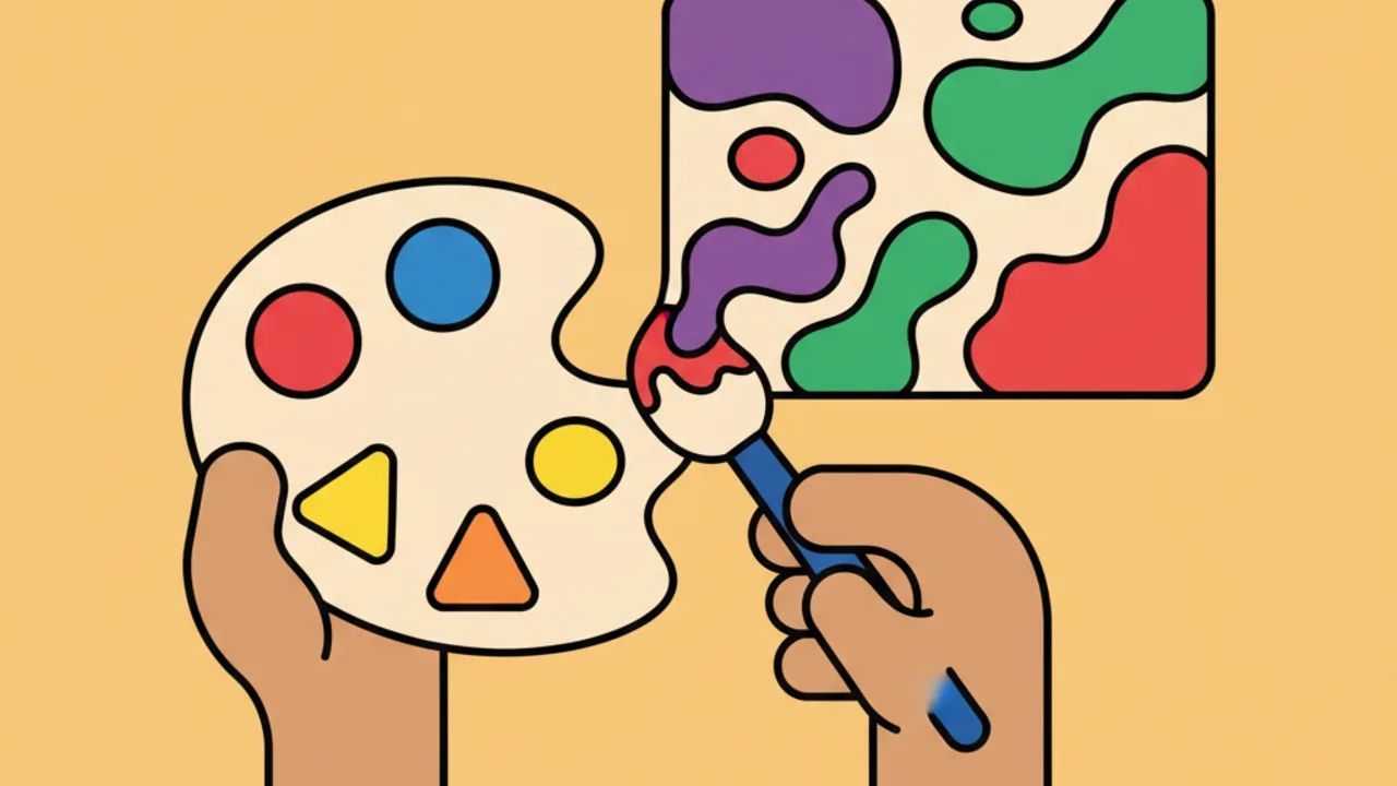
Learn how to mix primary and secondary colors in your favorite coloring pages. Easy tips to create stunning art on Drawing and Coloring! 🎨✨
Understanding Color Theory Basics for Coloring Pages
For those looking to master the art of bringing free printable coloring pages to life, understanding the color wheel basics is essential. As the school year picks up steam, learning about primary and secondary colors becomes both an educational and fun exercise.
Primary colors — blue, red, and yellow — are the building blocks that cannot be created by mixing other colors. They are the starting point for any kid-friendly line art you choose to print here at Desenhando e Colorindo. By applying them pure, you create a vibrant and bold look.
Secondary colors, on the other hand, emerge from the balanced union of two primaries. Green, orange, and purple (or violet) bring a new dimension to educational coloring sheets, allowing children and adults alike to explore complex nuances of nature and their favorite characters.
How to Identify and Use Primary Colors in Your Projects
When selecting coloring pages to print, primary colors should be your best friends for highlighting central elements. Imagine a superhero drawing; usually, the high-impact colors are red and blue, which convey strength and confidence.
Yellow is perfect for bringing light and joy to cute drawings of the sun, flowers, or small animals. It's a color that pops and works great as a background or a highlight in specific details of your digital coloring book.
Using these pure colors helps develop children's visual perception. When printing our free coloring sheets, encourage kids to identify where each primary color fits best, building a sense of visual hierarchy from an early age.
Pro-tip: When coloring with colored pencils, avoid pressing too hard on the primary colors. Light layers allow you to overlap other colors later to create amazing shading effects.
The Magic of Secondary Colors in Printable Coloring Sheets
When we move to secondary colors, the range of possibilities expands drastically. Green is born from mixing blue and yellow, making it the ideal color for nature coloring pages, forests, and fields in your printable art.
Orange, the result of red and yellow, is the color of energy and warmth. It looks excellent on fruit drawings, sunsets, or clothing details for dynamic characters found in our gallery of coloring activities.
Purple combines the mystery of blue with the intensity of red. It is a secondary color often used in fantasy themes, magic, and even AI-generated drawings that feature modern and surreal aesthetics.
Mixing Colors in Practice with Crayons or Pencils
One of the best ways to teach secondary colors is through direct mixing on paper. Choose one of our printable coloring pages and guide the child to paint a light layer of yellow and then a layer of blue on top to see green magically appear.
This physical experimentation is far superior to online coloring, as it develops fine motor skills and an understanding of pigmentation. It is an exercise in patience and discovery that turns a simple sheet of paper into an art lab.
Color Harmony: How to Balance Everything on Paper
Combining primary and secondary colors requires a bit of strategy so the final result doesn't look visually cluttered. A classic technique is using complementary colors, which are those opposite each other on the color wheel.
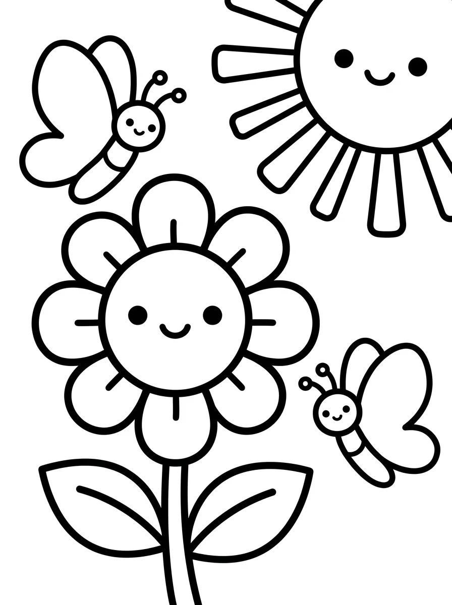
For example, purple (secondary) pairs perfectly with yellow (primary). If you have a drawing of a flower, purple petals with a yellow center will create a contrast that really makes your line art stand out.
- Blue and Orange: A great combination for sky scenes with vibrant terrestrial elements.
- Red and Green: The classic pairing that brings natural balance, widely used in botanical themes.
- Yellow and Purple: Offers high-impact contrast, ideal for drawing attention to specific details.
When planning your painting on our free drawings, try to choose one dominant color and use the others for accents. This prevents the drawing from becoming overwhelmed and maintains the visual harmony desired by artists of all ages.
Tips for Choosing the Best Coloring Materials
To get the best out of primary and secondary colors in printable coloring pages, material choice is key. Watercolor pencils are excellent for those practicing blending, as water helps fuse the pigments.
Crayons are more suitable for younger children, as they allow for covering large areas quickly with intense color. For adults who enjoy complex AI-generated coloring pages, fine-tip markers help define spaces between vibrant colors.
Regardless of the material, paper also matters. When printing your coloring pages from Desenhando e Colorindo, try using a slightly heavier paper (like 24lb or 32lb / 90g or 120g) if you plan to use a lot of ink or multiple layers of pencil.
Using White and Black for Color Transitions
While not primary or secondary colors in the traditional artistic sense, white and black help create pastels or deep shadows. Using white to soften a strong secondary color can give your work a professional touch.
Black should be used sparingly, mainly to reinforce line art contours or to create dramatic contrast in areas of total shadow, ensuring your vibrant colors really pop.
Exploring Educational Themes at Desenhando e Colorindo
Teachers often look for educational drawings to help reinforce art concepts. Working with primary and secondary colors through painting is an active learning methodology that makes knowledge stick in a playful way.
Our library offers thousands of options, from simple geometric shapes to detailed landscapes. You can print multiple copies of the same drawing to test different color palettes and compare the results.
- Animal Drawings: Perfect for testing shades of green and brown.
- Landscapes: Ideal for practicing the mix of blue and yellow to create different foliage greens.
- Characters: Great for applying complementary color concepts to uniforms and accessories.
- Mandalas: An excellent exercise in chromatic repetition using the full spectrum of primaries and secondaries.
While browsing the site, you'll find organized categories that make it easy to choose the perfect theme for today's practice. Remember, the main goal is to have fun and express your creativity through coloring pages.
Frequently Asked Questions
What are the 3 basic primary colors?
The three traditional primary colors in color theory for pigments (like paints and pencils) are blue, red, and yellow. From these, all other colors can be created.
How do I create the color green in my drawings?
To get green, you must mix equal (or proportional) amounts of the primary colors blue and yellow. If you want a lighter green, use more yellow; for dark green, increase the blue.
Can I mix primary colors in online coloring?
In online coloring, mixing works digitally (RGB system or color picker). While you don't physically blend brushes, you can choose any secondary shade directly from our site's digital palette.
What is the best technique for kids to learn secondary colors?
The best technique is hands-on experimentation. Print simple printable coloring pages and ask the child to color half an area with one primary color and the other half with another, overlapping them in the middle to see the secondary color appear.
Now that you know how to combine primary and secondary colors to create amazing art, it's time to get to work! Explore our vast collection of free printable coloring pages here at Desenhando e Colorindo. Choose your favorite themes, grab your pencils, and start creating a world full of color and joy right now! 🎨✨
Escrito e revisado por Armando Amaro
Fundador do Desenhando e Colorindo. Todo artigo passa por curadoria e revisão humana antes de ser publicado.