Mixing Primary and Secondary Colors in Coloring Pages
24 de setembro de 2026
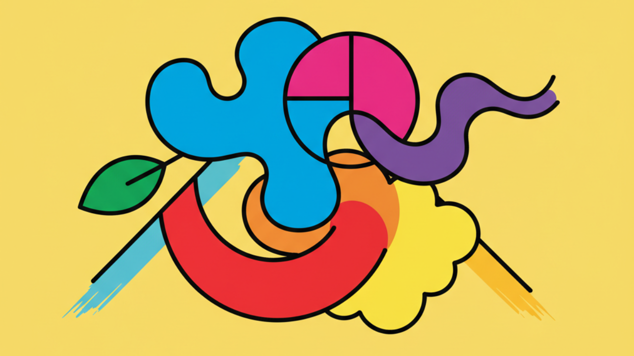
Master primary and secondary colors on your favorite coloring sheets! Pro tips for kids and beginners at Desenhando e Colorindo. 🎨✨
The Color Wheel in Coloring Pages and Printables
Understanding the basics of color is the first step to turning any coloring page into a true masterpiece. Primary colors—red, blue, and yellow—are the absolute starting point. They cannot be created by mixing other colors, which makes them the fundamental "source" for anyone using Desenhando e Colorindo to practice their artistic skills.
When you decide to download free printable coloring pages, your choice of colors defines the image's energy. Whether you are capturing the bright vibes of summer or the cozy tones of autumn, knowing how to mix these primary shades to get secondary ones is a technique every child or kid's line art enthusiast should master.
Secondary colors emerge from the balanced union of two primaries. Green (blue + yellow), orange (red + yellow), and purple (red + blue) offer a much richer palette to fill our educational drawings. By applying these combinations, you create depth and visual interest, making the coloring activity much more dynamic.
Why use only primaries at first?
For beginners, limiting the palette to primary colors helps in understanding contrast. On the Desenhando e Colorindo website, we have several cute drawings that work perfectly with this simplified scheme. Using only red, blue, and yellow forces the artist to focus on hand pressure and color saturation.
Pro Tip: Try painting a superhero drawing using only the three primary colors. The vibrant contrast between them creates a classic comic book look and helps highlight the main elements of the scene.
Mixing Techniques to Create Secondary Colors
The magic happens when the tips of the colored pencils overlap on the paper. For those who love printable arts, physical mixing on paper is an excellent way to learn. When coloring a leaf or a tree, instead of using a green pencil directly, try applying a light layer of blue and, on top of that, a layer of yellow.
This layering creates a secondary color that is much more organic and textured than using a pre-made color. In our drawings to color and print, we encourage users to test these transitions, especially in nature elements or complex characters where light and shadow make a difference.
Balancing Orange, Green, and Purple
Secondary colors bring harmony. Orange is vibrant, green is calming, and purple brings an air of mystery. Knowing how to balance these three secondary colors in a digital coloring book or printed sheet prevents the drawing from looking visually cluttered. If you are coloring a dragon or a fantasy landscape, secondaries are your best allies.
- Green: Ideal for grass, forests, and character eyes.
- Orange: Perfect for sunsets, flames, and sports clothing details.
- Purple: Great for wizard capes, rare flowers, and shadows in cool tones.
- Smooth Blending: Use light circular motions for seamless transitions.
Complementary Harmony: The Secret to Making Art Pop
One of the most effective ways to use primary and secondary colors is through complementary harmony. Complementary colors are those that sit opposite each other on the color wheel. For example, the opposite of red (primary) is green (secondary). By placing these two colors side by side in a coloring drawing, both appear more intense.
Using this concept in printable coloring pages helps guide the viewer's eye. If you want a character's bow to stand out, paint it red against a green background. At Desenhando e Colorindo, we offer templates that allow you to explore these contrasts in a clear and fun way.
Tone Variations with Colored Pencils
Don't forget that the pressure applied influences the final result. A secondary color can range from pastel to vibrant just by the strength of your hand. This is essential in kid's line art, where motor control is being developed. Constant practice with free drawings from our site allows children to understand how to create smooth gradients.
Printing Tip: When printing our drawings, prefer paper weights above 90g (24lb) if you plan on doing a lot of mixing and layering, to prevent the paper from tearing or becoming too marked.
Color Psychology in Coloring Activities
Colors aren't just visual; they convey emotions. Primary colors, being pure, usually pass a sense of clarity and direct energy. Secondary colors, being mixtures, bring more complex psychological nuances. When choosing coloring pages for your free time, consider what you want to feel.
Drawings with a predominance of blue and green tend to be more relaxing, while compositions focused on red and orange stimulate creativity and action. On the Desenhando e Colorindo portal, we have categories for every mood, from complex AI-generated drawings to simple shapes for quick relaxation.
Applying Colors to Nature Drawings
Nature-focused printable coloring sheets featuring flowers and gardens are always popular. It's the perfect opportunity to apply color theory. Use yellow (primary) for the center of the flowers and purple (secondary) for the petals. This combination grabs attention and creates a professional look even in simple art.
- Petals: Combine pink (a red mix) with purple for depth.
- Foliage: Use different shades of green, alternating pencil pressure.
- Sky: Try primary blue with touches of purple near the horizon.
- Sun: Mix yellow and orange for an intense glow effect.
Online Coloring vs. Paper Coloring
While online coloring is a modern and practical tool available on many platforms, the act of printing and using physical materials offers a unique sensory experience. At Desenhando e Colorindo, we encourage using paper so that children can feel the texture and learn to control the physical mixing of primary and secondary colors.
AI drawing technology has also helped create more precise outlines, making it easier for beginners to fill in. Regardless of the method, the important thing is the exploration of colors and the freedom to create new shades from the basic palette.
Tips for Teachers and Educators
Using educational drawings in the classroom is an excellent way to teach color theory in practice. Propose a challenge to students: they can only use three pencils (the primaries) to finish the entire drawing. This will force the discovery of secondaries through layering and empirical observation.
The Importance of White Space
Often, the best way to highlight the combination of primary and secondary colors is by leaving strategic white spaces. White acts as a visual breather, allowing vibrant colors to "jump" off the paper. In our free printable coloring pages, spaces are designed to allow this creative freedom.
Contrast with a white background helps in perceiving saturation. A secondary color like orange looks much brighter when surrounded by light areas than when squeezed between other dark colors. Use this to your advantage to create highlights in your art.
Frequently Asked Questions
What are the 3 primary colors?
The three primary colors are red, blue, and yellow. They are called so because they are pure colors that cannot be obtained by mixing other colors, serving as the basis for the entire color spectrum.
How do I make the color green in my drawings?
To create green, which is a secondary color, you must mix blue and yellow. If you want a lighter green, use more yellow; for a darker or forest green, add more blue to the mix.
Can I mix secondary colors together?
Yes! When you mix secondary colors, you get tertiary colors. For example, mixing green with orange creates earthy tones and ochres, great for painting tree trunks and soil in your coloring pages.
What is the best material for mixing primary colors?
Soft colored pencils, crayons, and gouache paints are the best materials for beginners to practice mixing primary and secondary colors. They allow for easy layering and immediate visualization of the result.
Start Coloring Now!
Now that you've mastered the basic theory of primary and secondary colors, it's time to get hands-on. Explore the vast library of Desenhando e Colorindo and pick your favorite themes. Remember, there are no hard rules in art: the main goal is fun and expressing your creativity. Visit our coloring pages to print section, grab your pencils, and bring new creations to life today!
Escrito e revisado por Armando Amaro
Fundador do Desenhando e Colorindo. Todo artigo passa por curadoria e revisão humana antes de ser publicado.